The sale of art is decided not by the object itself, but by the subconscious emotional environment you build around it.
- Color and composition are tools for psychological priming, not just aesthetic choices. They guide the viewer’s feelings and perceived value.
- Environmental factors like lighting, hanging height, and even background music are active levers that shape a buyer’s perception and behavior.
Recommendation: Shift your focus from simply presenting artwork to consciously curating the viewer’s entire sensory journey to architect their emotional response and, ultimately, their purchasing decision.
An artwork of undeniable quality sits on the wall, its colors vibrant, its composition masterful. And yet, it fails to connect. As a gallery director or artist, you’ve faced this frustrating paradox: a piece with immense potential that doesn’t sell. You’ve likely run through the standard checklist—adjusting the price, highlighting the artist’s intent, and ensuring the lighting is adequate. The conventional wisdom often stops there, repeating tired platitudes about “red being exciting” or “blue being calm.”
But what if the sale isn’t lost on the canvas, but in the ten feet of space between the art and the viewer? What if the color of the wall, the height of the frame, and the tempo of the background music are not just “atmosphere,” but active participants in the decision to buy? This is the realm of emotional architecture, where behavioral psychology meets visual aesthetics. It’s the understanding that you are not just selling an object; you are selling the feeling that object evokes, and that feeling is highly malleable.
This guide deconstructs the subconscious mechanisms that drive a viewer’s emotional and financial response to art. We will move beyond simplistic color associations to explore the powerful psychological triggers of composition, lighting, and sensory context. By mastering these elements, you can transform a passive viewing space into a persuasive emotional landscape, guiding viewers from appreciation to acquisition.
To navigate this deep dive into the psychology of art sales, the following summary outlines the key environmental and compositional levers we will explore. Each section unpacks a specific principle of emotional architecture you can apply within your gallery or studio.
Summary: The Psychological Triggers That Turn Viewers into Buyers
- Why Blue Artwork Sells Better in Corporate Office Environments?
- How to Use the Golden Ratio to Create Subconscious Visual Harmony?
- Abstract or Figurative: Which Elicits Stronger Empathy from Viewers?
- The Lighting Mistake That Kills the Emotional Impact of Warm Colors
- Hanging Art at Eye Level: The Height Rule That Changes Perception
- Why Teal and Orange Dominates Blockbusters despite Criticism?
- Why Slow-Tempo Music Increases Customer Spending by 15%?
- Placing Large Sculptures in Small Apartments Without Cluttering the Space
Why Blue Artwork Sells Better in Corporate Office Environments?
The prevalence of blue artwork in corporate settings is not a mere aesthetic coincidence. It is a strategic decision rooted in deep-seated psychological associations. Blue is consistently linked to feelings of stability, trust, and intellect. For a business, acquiring a blue-dominant piece is a non-verbal communication of its core values. The artwork becomes a symbol of reliability and calm authority, projecting an image of competence to both employees and clients. It subtly suggests a logical, serene, and forward-thinking environment, away from the chaos and passion often associated with warmer colors.
This desire for stability is also reflected in the art market itself. In uncertain economic times, collectors and corporate buyers gravitate towards dependable assets. As Jasper Tordoff of MyArtBroker notes in a recent market report, “Blue-chip artists offer a more stable and rewarding investment.” The color blue itself acts as a “blue-chip” signal. When a corporation chooses a piece dominated by cerulean, navy, or cobalt, it is unconsciously aligning its brand with the psychological safety net that the color provides. The artwork is no longer just decoration; it is an endorsement of the company’s perceived dependability and a strategic investment in its brand identity.
Therefore, when curating for a corporate client, the focus should be less on disruptive or passionate works and more on pieces that reinforce these key psychological tenets. The sale is often predicated on how well the artwork’s emotional signature matches the client’s desired corporate identity. The right shade of blue can close a deal by making the space—and the company—feel more trustworthy.
How to Use the Golden Ratio to Create Subconscious Visual Harmony?
The Golden Ratio is one of the most discussed concepts in art and design, often touted as a “divine proportion” or a universal formula for beauty. This mathematical relationship, approximately 1.618, is found in nature and has been used by artists for centuries to create compositions that feel inherently balanced and pleasing. The underlying psychological principle is cognitive fluency: the human brain finds it easier to process information that is well-organized and harmonious. A composition based on the Golden Ratio is, in essence, easier for our minds to “read,” and we misinterpret this ease of processing as beauty.

However, it is a mistake to treat it as a rigid, magical rule. The power of the Golden Ratio lies in its ability to create a sense of natural order, not in its precise mathematical application. As a behavioral psychologist would note, its influence is subconscious. Viewers don’t need to identify the ratio to feel its effects. The goal is to create a visual path that feels organic and holds the viewer’s gaze, guiding them through the artwork in a satisfying way. Spirals and section divisions that approximate these proportions prevent the composition from feeling static or chaotic.
It’s crucial to maintain a critical perspective. While the ratio is a powerful compositional tool, its connection to idealized beauty is often overstated. A 2024 comprehensive review in Maxillofacial Plastic and Reconstructive Surgery confirmed that “There is no convincing evidence that the golden ratio is linked to idealized human proportions or facial beauty.” Therefore, use it as a guide for creating subconscious harmony, not a blueprint for guaranteed sales. Its true value is in building a foundation of visual comfort upon which emotional color and content can have a greater impact.
Abstract or Figurative: Which Elicits Stronger Empathy from Viewers?
A common assumption is that figurative art, with its recognizable human forms and scenes, would naturally elicit a stronger empathetic response than abstract art. However, psychological research suggests the opposite can be true. The power of abstract art lies in its ability to trigger empathetic projection. When faced with ambiguous shapes and colors, the human brain actively works to find patterns and meaning, a phenomenon known as pareidolia. Viewers subconsciously project their own emotions, memories, and even human forms onto the canvas, creating a deeply personal and unique connection.
This is not mere speculation. A groundbreaking 2024 eye-tracking study on abstract art perception revealed how this process works. Researchers found that viewers’ eyes scan abstract works in patterns that suggest they are subconsciously searching for and constructing human-like forms. The brain, in its effort to make sense of the unknown, forces an empathetic connection even where one isn’t explicitly depicted. This act of co-creation—where the viewer’s mind completes the artwork—can result in a more profound emotional investment than simply recognizing a figure painted by the artist.
For galleries, this means abstract art should not be positioned as purely decorative. It is an invitation for deep, personal engagement. To facilitate this, curation can play an active role. Positioning abstract pieces at eye level encourages this personal projection, while strategic lighting can create shadows that hint at forms. Furthermore, titling works with emotionally evocative single words (e.g., “Solitude,” “Expanse”) can prime the viewer’s response, guiding their empathetic journey without dictating it. The ambiguity of abstract art is not a weakness; it is its greatest psychological strength.
The Lighting Mistake That Kills the Emotional Impact of Warm Colors
You have a painting that bursts with passionate reds, joyful yellows, and vibrant oranges. It’s designed to evoke feelings of energy, warmth, and optimism. Yet, in the gallery, it looks flat, lifeless, and almost muddy. The most common culprit is a critical but often overlooked technical detail: the Color Rendering Index (CRI) of your lighting. Using lighting with a low CRI is the single fastest way to kill the emotional impact of warm-toned artwork. It creates a powerful cognitive dissonance where the color the viewer expects to see is not what is actually perceived, breeding subconscious mistrust.
CRI is a scale from 0 to 100 that measures a light source’s ability to reveal colors faithfully compared to natural light. A low-CRI bulb, particularly a cool-toned LED, lacks the full spectrum of light necessary to render warm colors accurately. Reds appear brownish, and yellows can look greenish and dull. This doesn’t just make the art look “bad”; it fundamentally breaks the emotional promise made by the artist. The intended feeling of passion is replaced by a sense of disappointment and confusion, effectively neutralizing any potential for a purchase.
For spaces where art is sold, aiming for the highest possible CRI is non-negotiable. Lighting is not an expense; it is an investment in emotional integrity.
| CRI Rating | Color Rendering Quality | Impact on Warm Colors | Recommended Use |
|---|---|---|---|
| >95 | Excellent | Full spectrum, vibrant reds/yellows | Art galleries, high-end retail |
| 80-95 | Good | Slightly muted warm tones | General retail, offices |
| <80 | Poor | Dull, muddy appearance | Not recommended for art display |
As the table illustrates, a CRI of 95 or higher is the professional standard for galleries. It ensures that the warm, emotional colors conceived by the artist are the same ones experienced by the buyer. Sacrificing light quality is akin to asking a musician to perform with an out-of-tune instrument—the intended emotional message is lost in the poor execution.
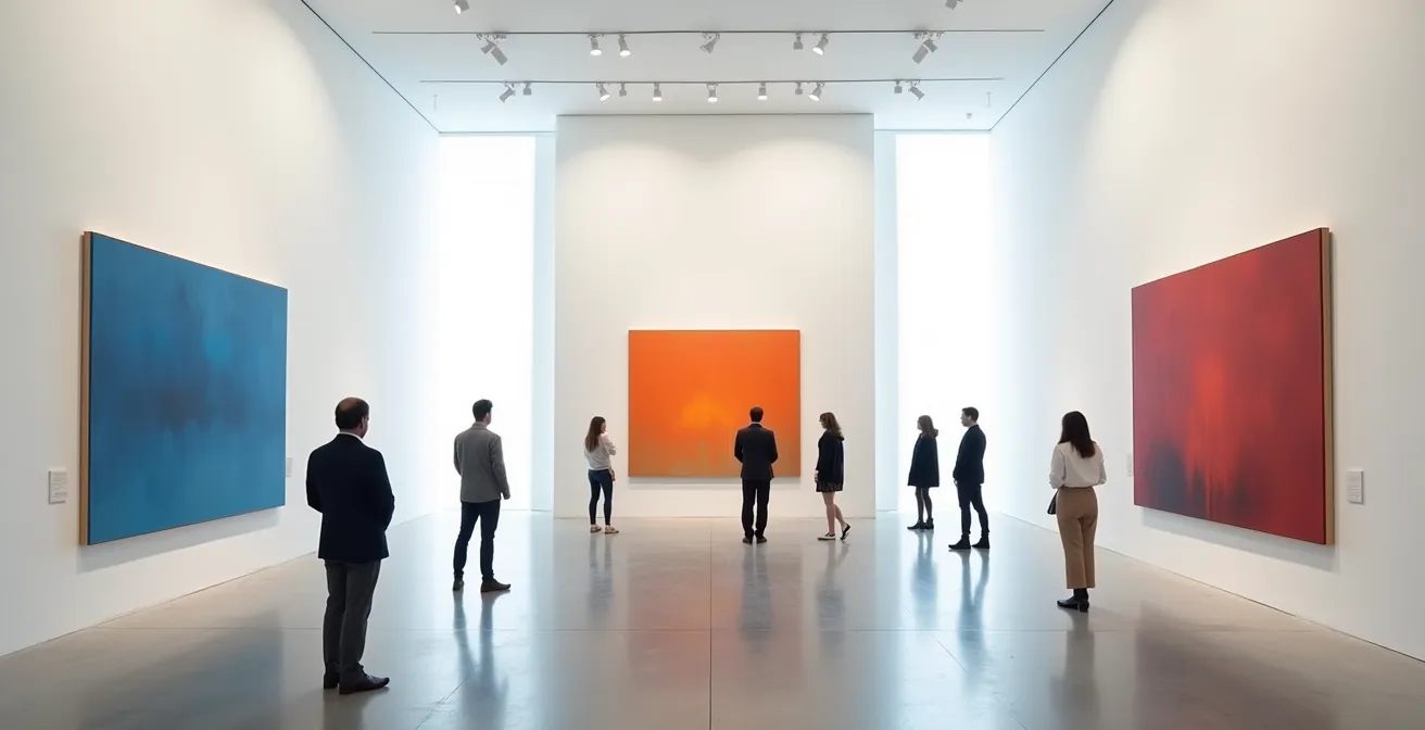
Hanging Art at Eye Level: The Height Rule That Changes Perception
The “hang at eye level” rule, typically centered at 57 inches, is a well-known curatorial standard. But treating it as an immutable law ignores its psychological power as a tool for manipulating perception. The height at which an artwork is hung directly influences the viewer’s physical posture and, consequently, their emotional relationship with the piece. As Contemporary Gallery Curators note in their principles of modern practice, “A low hang forces the viewer to look down, creating a personal, intimate connection, while a high hang forces an upward gaze associated with reverence.”
This principle is actively used to differentiate between educational and commercial environments. An analysis of major museum and gallery practices reveals a telling split. Museums, focused on education and analytical viewing, often adhere to the 57-inch standard. However, commercial galleries increasingly adopt heights of 60 to 65 inches. This subtle increase is a deliberate psychological strategy. By forcing the viewer to tilt their head slightly upward, the gallery creates an “aspirational gaze.” This posture is subconsciously associated with looking up to something of great importance or status, which in turn can increase the artwork’s perceived value and desirability.
Choosing a hanging height is therefore an act of perceptual framing. Are you trying to foster an intimate, introspective connection with a smaller, detailed piece? A slightly lower hang might be appropriate. Are you presenting a large, impactful work that you want to position as a high-value statement piece? A higher hang can subtly command that respect. The 57-inch rule is a safe baseline, but the real curatorial artistry lies in knowing when and why to break it to architect a specific emotional response.
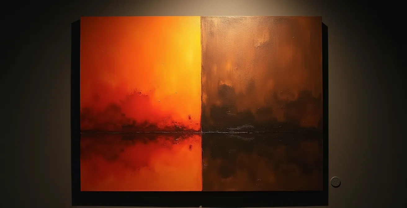
Why Teal and Orange Dominates Blockbusters despite Criticism?
The teal and orange color palette, ubiquitous in blockbuster films, is often criticized for being a lazy, formulaic cliché. But from a psychological standpoint, its dominance is no accident. This complementary color scheme is a powerful and efficient biological hack for directing attention. The human brain is hardwired to pay attention to skin tones, which fall within the orange-to-pink range. When placed against a background of teal or blue—a color that is relatively rare in large swaths in nature and which our eyes are less sensitive to—the “human” element of the scene instantly pops. It’s a method of creating extreme figure-ground separation.
This isn’t just a cinematic trick; it’s a potent tool for gallery curation. By understanding this principle, you can guide the viewer’s eye and create dramatic focus. Instead of using neutral white walls, a deep teal feature wall can make any artwork with warm or flesh tones feel more vibrant and alive. It leverages the same subconscious mechanism that makes movie stars stand out on screen. The goal is to create a dynamic tension that makes the art feel more present and significant.
However, in a world saturated with this combination, deploying a more nuanced palette can itself be a statement. As one Art Market Analysis on contemporary color theory observes, “In a world saturated with teal and orange, using a more subtle, analogous color scheme becomes a statement in itself, signaling a more sophisticated, less commercial sensibility.” The choice is yours: use the power of teal and orange for dramatic focus, or subvert it to signal a different kind of value.
Action Plan: Leveraging Teal and Orange Theory in Your Gallery
- Feature Walls: Paint a single, strategic wall in a deep, matte teal to make artworks with warm tones (or portraits) pop with life.
- Accent Lighting: Use orange or warm-toned accent lighting (sconces, spotlights) to create “zones of warmth” within a larger, cooler-toned space, guiding visitors to focal points.
- Dynamic Juxtaposition: Position a blue-dominant artwork on a wall directly opposite a piece rich in oranges and reds to create a powerful visual dialogue and tension across the space.
- Path Creation: Design viewing paths that deliberately move visitors from a cool, teal-lit area to a warmly lit one, creating a journey of shifting emotional temperatures.
- Time-Based Shifts: If using smart lighting, program a subtle shift from a neutral or cool white during the day to a warmer, orange-hued ambiance in the evening to alter the mood of the entire collection.
Why Slow-Tempo Music Increases Customer Spending by 15%?
The soundscape of a gallery is one of the most underestimated tools of emotional architecture. Many curators either default to silence or choose music based on personal taste. This overlooks a key psychological principle: sensory priming. The tempo and volume of background music directly influence a visitor’s physiological state and behavior, including their movement speed and spending habits. Slower, low-volume music has been shown to be particularly effective at increasing sales in retail environments, a principle that translates directly to the gallery space.
The mechanism is straightforward. Fast-tempo music increases heart rate and arousal, encouraging faster movement and more impulsive, less considered decisions. Conversely, slow-tempo music is calming. It encourages visitors to slow their pace, linger longer in front of each piece, and engage in more thoughtful contemplation. This extended viewing time allows for deeper emotional connections to form with the artwork, which is a critical precursor to a high-value purchase. In fact, a landmark retail study demonstrated a 32% increase in sales in environments with slow-tempo background music compared to those with fast-tempo music.
The ideal gallery soundscape is not silent, nor is it a performance. It is a subtle environmental cue designed to slow down time. Ambient, minimalist, or classical music with a tempo below 70 beats per minute is highly effective. The volume should be low enough that it is barely noticeable, existing at the edge of conscious perception. By carefully curating the auditory environment, you are not just playing music; you are shaping your visitors’ perception of time and creating the ideal conditions for a considered, emotionally resonant purchase decision.
Key Takeaways
- Architect the Emotion: Your primary role is not to decorate a space but to build an emotional journey for the viewer, using every environmental element as a psychological tool.
- Frame the Perception: The perceived value and meaning of an artwork are not fixed; they are actively shaped by its context, including lighting, hanging height, and surrounding colors.
- Manage Cognitive Load: Make it easy for the brain to process beauty. Whether through harmonious composition or a minimalist environment, reducing a viewer’s subconscious effort enhances their emotional connection.
Placing Large Sculptures in Small Apartments Without Cluttering the Space
The challenge of placing a large sculpture in a confined residential space is fundamentally a problem of cognitive load and visual hierarchy. When a dominant object is introduced into a small room filled with other furniture and decor, the brain is overwhelmed with competing focal points. The result is a feeling of clutter and chaos, where neither the sculpture nor the room can be properly appreciated. The common-sense approach of “trying to make it fit” is destined to fail. The correct, albeit radical, solution is to stop trying to fit the sculpture into the room and instead redesign the room around the sculpture.
This principle, as noted by Interior Design Quarterly, is about “radical simplification.” To allow a large sculpture to “breathe” and command the space it deserves, you must eliminate visual competition. This involves removing all non-essential decorative elements—throw pillows, competing artwork, and miscellaneous objects. The goal is to create a minimalist backdrop where the sculpture is the undisputed hero. Using a monochromatic color scheme for the walls and remaining furniture further reduces visual noise, forcing the eye to settle on the sculpture’s form and texture.
Strategic use of light and reflection can also create the illusion of more space. Placing a large mirror on an adjacent wall can visually double the room’s volume and provide new angles from which to view the sculpture. Targeted uplighting from the floor can dematerialize the sculpture’s base, making it feel lighter and less imposing. Finally, always prioritize vertical sculptures over horizontal ones in small spaces, as they draw the eye upward and leverage the room’s height, creating a sense of expansiveness rather than compression. By ruthlessly editing the environment, you allow the sculpture to define the space, turning a potential weakness into a powerful statement.
To transform your space from a simple showroom into an engine of emotional connection, the next step is to begin viewing every curatorial choice through a psychological lens. By consistently applying these principles, you architect an experience that doesn’t just show art, but sells it.