The key to believable sci-fi world-building on a budget isn’t expensive props; it’s creating “narrative residue” that tells a story.
- Focus on weathering and texture to give every object a history.
- Use color, lighting, and even background extras to reinforce your world’s core emotional truth.
Recommendation: Stop trying to build a world. Start curating the believable fossils it left behind.
You’re a production designer with a brilliant sci-fi script and a budget that barely covers catering. The dream is a world as dense as Blade Runner, but the reality feels closer to a school play with tinfoil. The common advice is to get “creative” with lighting or scavenge a local junkyard. While not wrong, this approach often leads to worlds that feel like a collection of cool-looking junk rather than a place someone could actually live, or more importantly, survive.
The trap is thinking that your job is to make things look “futuristic.” It’s not. Your job is to build a convincing history. When you have a limited budget, you can’t afford to waste a single visual element. Every prop, every costume, every splash of color must do more than just exist; it must be a piece of evidence, a fossil of the world’s story. For indie filmmakers, where visual effects can consume 20-25% of the total budget, you can’t afford to fix a sterile-looking set in post-production.
This is where the concept of “narrative residue” comes in. Instead of asking “What looks sci-fi?”, we will ask “What story does this object tell?”. We’ll explore how to deliberately craft the dirt, the damage, and the details that make a world feel not just seen, but *felt*. This guide is about transforming limitations into a powerful aesthetic, proving that the most compelling worlds aren’t bought, they’re excavated.
This article provides a practical roadmap for building these rich, story-driven worlds. From weathering props with intent to directing the silent stories of your background actors, you’ll learn to make every frame count. Here’s a look at the key strategies we’ll cover.
Summary: A Production Designer’s Guide to Resourceful Sci-Fi World-Building
- Why Clean Props Break Immersion in Post-Apocalyptic Settings?
- How to Direct Background Extras to Make a World Feel Lived-In?
- Monochromatic or Triadic: Which Palette Defines Your Dystopia?
- The Green Screen Mistake That Makes Practical Sets Look Fake
- Scavenging for textures: The scrapyard Items That Look Like Alien Tech
- How to Source Period Costumes from Thrift Stores and Donations?
- Optimizing High-Res Textures for Mobile VR Without Losing Detail
- How to Use Color Grading to Subconsciously Alter Viewer Emotion?
Why Clean Props Break Immersion in Post-Apocalyptic Settings?
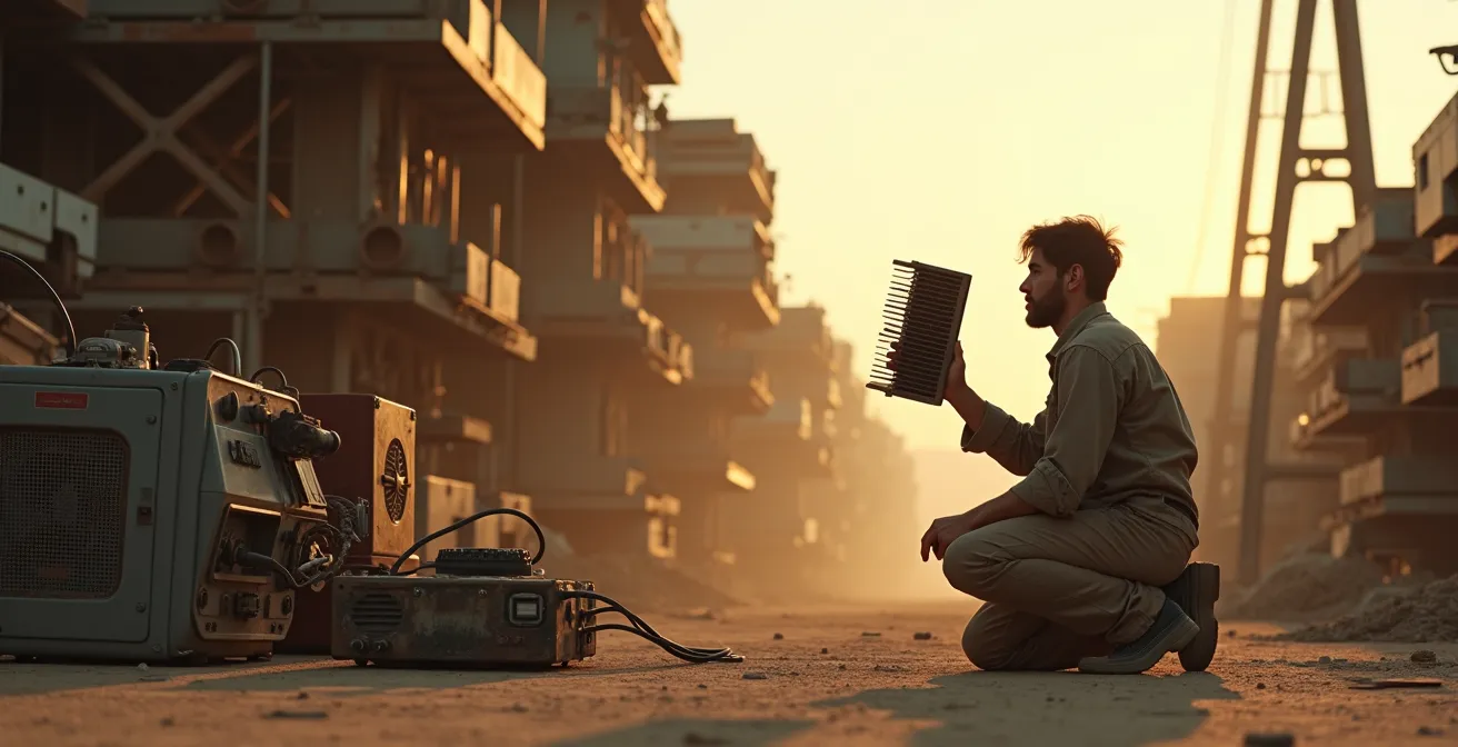
In a world defined by scarcity and struggle, a clean, factory-fresh prop is the loudest lie you can tell your audience. Immersion is built on a foundation of believable history, and in a post-apocalyptic setting, that history is written in dirt, rust, and repair. A pristine rifle isn’t just unrealistic; it’s a narrative black hole. Where did it come from? How has it been maintained? Its cleanliness erases any story of survival it was meant to represent. The grime is the story. This is what we call narrative residue.
Weathering isn’t about randomly applying brown paint. It’s a forensic process. Ask questions about the object’s life. A weapon’s grip would be worn smooth, its barrel scratched from being holstered, the area around the trigger guard polished by a nervous thumb. These specific points of wear are design fossils that tell a micro-story about its user. It’s the difference between a prop that’s merely “dirty” and one that feels used, cherished, and essential for survival.
Effective weathering techniques focus on simulating these natural processes of decay and use. It’s about creating layers of history. For instance, applying a mist of water before painting can create authentic wear by preventing perfect adhesion, mimicking years of exposure. Similarly, using sandpaper or a wire brush on high-contact areas creates a tactile history that sells the reality of your world far more effectively than any line of dialogue could. The goal is a prop that feels like an artifact from your world, not a purchase from a prop house.
Ultimately, a “dirty” prop is a character in its own right, one that silently testifies to the harsh realities of the world you’ve built. A clean prop, by contrast, is a silent extra who missed their cue.
How to Direct Background Extras to Make a World Feel Lived-In?
A believable world doesn’t stop at the edge of the main action. Nothing shatters immersion faster than a crowd of background extras standing around like bored mannequins. On an indie budget, you can’t afford a cast of thousands or complex CGI crowds. Your solution is to treat every extra not as a space-filler, but as the protagonist of their own silent, one-second movie. This creates layers of life, transforming a static backdrop into a dynamic, breathing environment.
Instead of telling extras to “look busy,” give them a simple, specific, and motivated action. Don’t say, “Walk across the market.” Say, “You’re trying to trade a broken water filter (this prop) for a handful of bullets. You think the person at that stall is cheating you.” This micro-narrative gives the actor a motivation, a physical objective, and an emotional state. The audience may only glimpse this for a moment, but the authenticity of the interaction registers, adding to the overall density of the scene.
This technique allows you to suggest scale without needing to show it. Director Michael O’Halloran’s approach on the indie sci-fi film Space/Time is a perfect example. As noted in a case study, he leaned into limitations to suggest scale rather than overspending, letting intention do the heavy lifting. By giving each small part a rich, implied story, he made his world feel vast and populated. A busy marketplace scene is more believable because of a few distinct, layered interactions than a hundred aimless wanderers.
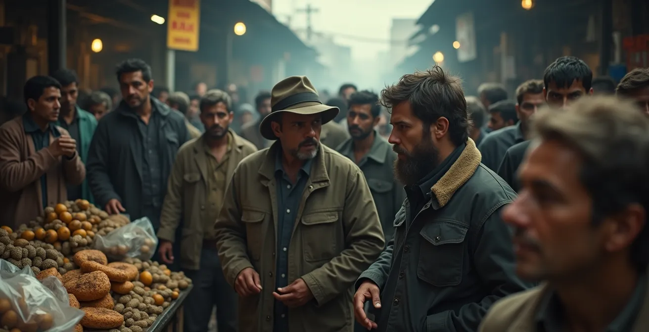
As this image illustrates, the feeling of a dense, living world comes from these overlapping individual stories. One person haggles, another is on guard, a third is lost in thought. By directing these small moments, you create a rich tapestry of human life that makes the audience feel like they’re looking through a window into a real place, not just watching a film set.
Your extras are your cheapest world-building tool. Use them wisely, and they’ll populate your world with more life and history than any expensive set piece ever could.
Monochromatic or Triadic: Which Palette Defines Your Dystopia?
Color is your most powerful and cost-effective tool for establishing a world’s emotional tone. Before a single word is spoken, your color palette tells the audience what to feel. Is this world sterile and oppressive? Hopeful but decaying? Unnaturally vibrant and therefore menacing? The choice between a limited, monochromatic palette and a more complex triadic scheme isn’t just aesthetic; it’s a fundamental world-building decision that defines the psychological landscape of your story.
A monochromatic or analogous palette (using colors that sit next to each other on the color wheel) is often a shorthand for oppression and control. Think of the washed-out blues and greys of a corporate-run state or the dusty, sun-bleached yellows of a dying planet. This limited range creates a sense of uniformity and stagnation. Conversely, a carefully chosen triadic scheme (three colors evenly spaced on the color wheel) can create visual tension and signal competing ideologies or environmental forces. A flash of a vibrant, rebellious red in an otherwise muted green-and-brown world can be a powerful storytelling device.
This connection between color and narrative is not just theory; it’s a proven cinematic technique, even in films with significant budgets. As Fiona Walkinshaw, CEO of Framestore, notes, while budget buys you scale, ” creativity and resourcefulness go a long way.” This resourcefulness is most evident in how a film’s color approach serves its story.
Examining successful films reveals how specific palettes create narrative meaning.
| Film | Budget | Color Approach | Narrative Purpose |
|---|---|---|---|
| Ex Machina | $15M | Cool blues/whites | Clinical detachment, artificial intelligence |
| Men | $5M | Oversaturated greens | Natural horror, organic unease |
| Godzilla Minus One | $15M | Desaturated with selective reds | Post-war devastation, danger signals |
This table demonstrates that color is a deliberate narrative choice, not an afterthought. Your budget doesn’t dictate your ability to use color effectively. A consistent and intentional palette, whether applied through set dressing, costumes, or final color grading, is a free tool to make your world feel cohesive and emotionally resonant.
Choose your palette as carefully as you choose your script. It will define the unspoken laws of your universe and become a subconscious guide for your audience’s journey.
The Green Screen Mistake That Makes Practical Sets Look Fake
The single biggest mistake in low-budget green screen work isn’t a bad key or a poorly tracked shot; it’s a fundamental disconnect in lighting. You can have the most beautifully designed practical set, but if the actor standing in front of a green screen is lit differently from the digital background they’re composited into, the audience’s brain will scream “fake.” The human eye is an expert at detecting lighting inconsistencies, and this error instantly shatters immersion.
The solution is not to abandon green screen, but to think of it as an extension of your practical set. The lighting on your actor must be motivated by the digital environment. Is there a flickering neon sign in the background plate? Your actor needs a corresponding interactive light flickering on their face. Is the sun setting on the left in your digital matte painting? Then the key light on your actor must also come from the left, with the same color temperature and quality (hard or soft). It’s about creating a unified lighting scheme across both the real and virtual elements.
For the ultimate in seamless integration, consider capturing effects in-camera whenever possible. On the micro-budget feature Alone, the filmmakers brilliantly avoided post-production headaches by projecting pre-rendered VFX of a black hole onto a screen outside the spaceship window. This meant the complex lighting from the visual effect was captured interacting with the actors and the set in real-time, creating a perfectly integrated and utterly believable shot that would have been a nightmare to composite traditionally.
Action Plan: Critical Light Matching Checklist for Green Screen
- Match light quality (hard vs. soft) between foreground actors and digital background plates.
- Add interactive light spill from background elements onto actors (flickering neons, passing vehicles).
- Preserve natural edge blur and motion blur instead of creating artificially sharp composites.
- Ensure lens characteristics (focal length, depth of field) match between practical and digital elements.
- Include atmospheric elements (haze, dust motes) in both foreground and background for cohesion.
Don’t let your practical set be undermined by a lazy green screen setup. By treating light as the glue that binds the real and the digital, you can create composites that feel tangible, immersive, and, most importantly, believable.
Scavenging for textures: The scrapyard Items That Look Like Alien Tech
The go-to advice for indie sci-fi is “go to a scrapyard.” But aimless scavenging results in sets that look like… well, a pile of junk. The secret isn’t finding “futuristic” objects; it’s about finding a textural language. You’re not looking for whole objects; you’re hunting for patterns, repeating shapes, and unique surfaces that can become the architectural DNA of your world. A single, consistent texture repeated across different props, sets, and costumes creates a sense of cultural cohesion that sells a world better than any single hero prop.
Think beyond the object’s original purpose and focus on its form. The fins of a computer heat sink, when viewed up close, are not just a piece of an old PC. They are a miniature, alien cityscape. The iridescent surface of a hard drive platter is not a data storage device; it’s a piece of exotic armor. The intricate pathways of a circuit board are a topographical map of a lost city. By abstracting these everyday items through macro photography, creative framing, and repetition, you create a unique and cohesive visual library for your world.

As this close-up shows, familiar objects can be rendered alien and compelling by focusing on their texture and pattern. The key is to establish this “language” and then apply it consistently. If the heat sink pattern is your alien race’s architectural motif, then perhaps their weapons have similar fins, and the clasps on their clothing echo that same grooved pattern. This repetition creates a subconscious sense of authenticity.
Case Study: DIY Sci-Fi from the Home Store
The principle of using simple, repeating elements is highly effective. A visit to one low-budget sci-fi set revealed control consoles built from plywood, but made convincing through the clever application of home store basics. They used a consistent language of pointless toggle switches, gem lights, and square buttons. Through intentional lighting, atmospheric smoke, and the right camera angles, these simple, cheap materials were transformed into a believable and high-tech-looking environment.
Stop looking for spaceships in the scrapyard. Start looking for the textures, patterns, and shapes that will become the alphabet of your alien world. Build your language, and the world will build itself.
How to Source Period Costumes from Thrift Stores and Donations?
For a sci-fi film, “period” can mean post-apocalyptic, far-future dystopia, or retro-futuristic. Your characters’ clothing is their personal environment, the most intimate layer of world-building. On a tight budget, the thrift store is your armory, but the mission isn’t to find a perfect “costume.” It’s to hunt for silhouettes, materials, and unique elements that can be harvested and repurposed. A believable costume is layered with the same narrative residue as a good prop; it tells the story of the person who wears it.
Your first pass should ignore color and pattern and focus entirely on silhouette and material. Look for the shapes that define your world’s era or social class. Are they flowing and loose, or tight and utilitarian? Then, prioritize natural materials like wool, cotton, and leather. These fabrics take to weathering—staining, sanding, and fraying—in a much more authentic way than synthetics. A 100% wool coat from the 1970s might be the wrong color, but its shape and material are a perfect base for a dystopian officer’s greatcoat.
Don’t be afraid to be a vulture. An unsalvageable, moth-eaten garment might have a unique set of buttons, a perfectly worn leather collar, or a patch that can be harvested and transplanted onto another piece. This is costume design as collage. Your focus should be on creating a few hero costumes for your main characters, while background extras can be made to look the part with a single, strong period accessory—a specific style of hat, a pair of goggles, or a type of scarf. This creates a sense of uniformity without breaking the bank. With post-production consuming 15-30% of an indie budget, every detail you can perfect in-camera saves you a fortune down the line.
A successful sci-fi costume from a thrift store is rarely found; it’s assembled. It’s a Frankenstein’s monster of silhouettes, textures, and scavenged details that, when put together, tells a story of survival, status, and identity in the world you’ve built.
Optimizing High-Res Textures for Mobile VR Without Losing Detail
While this topic specifies mobile VR, the core principle is universal for any indie filmmaker working with digital assets: how do you achieve maximum visual detail with minimum processing power and budget? Whether for a VR environment or a VFX shot in a film, the goal is the same: create the illusion of high resolution without grinding your render farm—or your one workstation—to a halt. The secret lies in baking detail, not modeling it.
The fundamental technique is using normal maps and ambient occlusion (AO) maps. In essence, you take an incredibly detailed, high-polygon model (that would be impossible to use in a final shot) and “bake” its surface detail and lighting information onto a texture map. This map is then applied to a simple, low-polygon model. The result is a model that looks almost as detailed as the original but uses a tiny fraction of the processing power. It’s the digital equivalent of a Hollywood false front—all the detail is on the surface.
This efficiency is crucial for indie productions. You can focus your time on creating one or two beautiful, high-detail assets and then bake those details onto lightweight models that can be duplicated throughout a scene. Furthermore, combining multiple textures into single “atlas sheets” drastically reduces the number of draw calls, which is a major performance bottleneck. For filmmakers, this means faster render times and the ability to have more complex scenes without needing a supercomputer. These are the same principles that are revolutionizing high-end productions through virtual production stages.
Case Study: The Efficiency of Virtual Production
The power of real-time, optimized assets is demonstrated by Dimension Studio’s work on the series Those About to Die. The studio completed around 2,000 complex visual effects shots on a virtual production stage, which relies on highly optimized real-time assets. This was achieved at a fraction of the cost of traditional visual effects, showcasing how smart texture and model optimization can deliver blockbuster-scale results on a more contained budget.
Don’t waste time and resources trying to render impossibly complex scenes. Work smarter by baking your detail into efficient textures. This allows you to build rich, detailed digital worlds that look a million bucks, without costing it.
Key Takeaways
- Believability comes from history, not budget. Every prop should tell a story through wear and tear.
- Use a consistent “textural language” and color palette to create a cohesive and immersive world.
- Direct your background extras with micro-narratives to make your world feel populated and alive.
How to Use Color Grading to Subconsciously Alter Viewer Emotion?
Color grading is the final and most potent step in baking your world’s emotional DNA into the image. It’s the last coat of paint, the final filter through which the audience experiences your story. This is where you can unify all the elements you’ve painstakingly created—the weathered props, the scavenged costumes, the carefully lit sets—into a single, cohesive visual statement. More than just making things “look cinematic,” color grading is a tool for psychological manipulation, subtly guiding the viewer’s emotions scene by scene, often without them ever realizing it.
The technique of split-toning is one of the most effective tools in your grading arsenal. It involves pushing your shadows toward one color and your highlights toward another. This creates an immediate and subconscious emotional effect. The classic “teal and orange” look is popular for a reason: the warm, orange highlights on skin tones feel human and familiar, while the cool, blue-green shadows introduce an underlying tension and unease. This simple color contrast can make a perfectly normal conversation feel fraught with hidden danger.
By defining a set of color rules for your world, you create a powerful narrative shorthand. Perhaps all scenes in the “safe” rebel hideout have warm, golden highlights, while anything in the corporate-controlled city is drenched in a sickly, green-yellow hue. This consistency gives the audience a subconscious roadmap to the emotional landscape of your film. A sudden break from this pattern—a flash of warm gold in the oppressive city—becomes an incredibly powerful story beat, signaling a moment of hope or a precious memory.
The emotional impact of these choices is not arbitrary. Different color combinations evoke specific feelings, and a good colorist uses this palette to amplify the story.
| Shadow Tone | Highlight Tone | Emotional Effect | Use Case |
|---|---|---|---|
| Cool Blue | Warm Orange | Underlying tension | Seemingly normal scenes with hidden danger |
| Green | Yellow | Sickness/unease | Character illness or environmental toxicity |
| Purple | Pink | Surreal disconnect | Dream sequences or altered reality |
| Neutral Gray | Warm Gold | Nostalgia with loss | Memory sequences or flashbacks |
Your indie sci-fi film may not have the budget for sprawling cityscapes, but it has full access to the entire spectrum of human emotion. Use color grading not just to make your film look good, but to make your audience feel the world you’ve so carefully built.
Frequently asked questions on Indie Sci-Fi World-Building
How do you make cheap props look expensive or real?
The key isn’t to make them look expensive, but to make them look *real*. This is achieved through weathering and storytelling. A prop’s value in a sci-fi world is its history. Use techniques like sandpaper on high-contact areas, tea or coffee staining for aging, and adding layers of grime with paint washes or fuller’s earth. A prop with a visible history of use feels more authentic and valuable to the world than a pristine, expensive-looking one.
What is the most important element of world-building for a film?
The most important element is narrative consistency. Every single element the audience sees—from a costume button to the color of the sky—should feel like it belongs to the same world and tells the same story. This is achieved by creating a “textural language” and a consistent color palette, and ensuring that all props and costumes are imbued with “narrative residue” that reflects the history and conditions of the world.
How can I create a sci-fi film with almost no money?
Embrace your limitations and focus on suggestive scale rather than literal scale. Tell a story that can be contained in one or two locations you can control. Use “narrative residue” to make those few spaces feel incredibly rich and historic. Focus on micro-narratives with your actors and extras to imply a larger, living world. Master in-camera effects and smart lighting. A compelling sci-fi story is about a great idea, not a great budget.