Contrary to the popular belief that color grading is about applying simple “color = emotion” formulas, true mastery lies in understanding it as a tool for narrative control. This guide bypasses the clichés to reveal how senior colorists manipulate psychological cues, navigate technical compromises, and intentionally break conventions to guide an audience’s feelings with precision, turning color from mere aesthetic into a powerful, subconscious storytelling device.
Color is a language. Before a single word of dialogue is spoken, the color palette of a film has already begun to tell the audience how to feel. We’re not talking about color correction—the technical process of balancing footage to a neutral, true-to-life baseline. That is the necessary, sterile foundation. We are talking about color grading: the art of intentionally pushing color away from reality to build a world, define a character, and, most importantly, dictate emotion. Most guides will give you the rudimentary vocabulary: red is passion, blue is sadness. But for a director or a colorist, that’s like telling a novelist that “A is for apple.”
The real work, the art of it, happens in the nuances. It’s about understanding *why* a specific, slightly desaturated teal can create a sense of clinical unease, while a vibrant, warm orange can evoke nostalgia or suffocating heat. It’s about knowing how to craft a stylized, aggressive look for a scene without making the actors look jaundiced or ill. This isn’t about following rules; it’s about mastering them so you know how and when to break them with intent.
This deep dive moves beyond the software manuals and the simplistic color psychology charts. We will explore the professional mindset required to wield color as a narrative weapon. We will dissect why dominant trends exist, how to protect the integrity of your image when pushing it to its limits, and how the very environment your audience watches your film in can undo all your hard work. This is about the subtle craft of perceptual control.
For those who prefer a visual introduction to these concepts, the following video offers a compelling overview of how color influences our perception and emotional responses in media.
To fully grasp the mechanics behind these emotional manipulations, this article breaks down the core professional challenges and artistic choices a colorist faces. From dissecting controversial trends to mastering technical workflows, each section provides a piece of the puzzle for achieving true narrative intentionality with your grade.
Summary: Mastering Color Grading as a Narrative Tool
- Why Teal and Orange Dominates Blockbusters despite Criticism?
- How to Grade a Stylized Look Without Ruining Skin Tones?
- LUTs or Manual Grade: Which Offers More Control Over the Final Image?
- The Calibration Mistake That Makes Your Film Look Green on TV
- Desaturation vs. Vibrance: Visual Cues for Flashbacks?
- Why Blue Artwork Sells Better in Corporate Office Environments?
- How Lighting Temperature Alters the Perception of Classical Paintings?
- Creating Believable Sci-Fi Worlds on a Limited Indie Budget?
Why Teal and Orange Dominates Blockbusters despite Criticism?
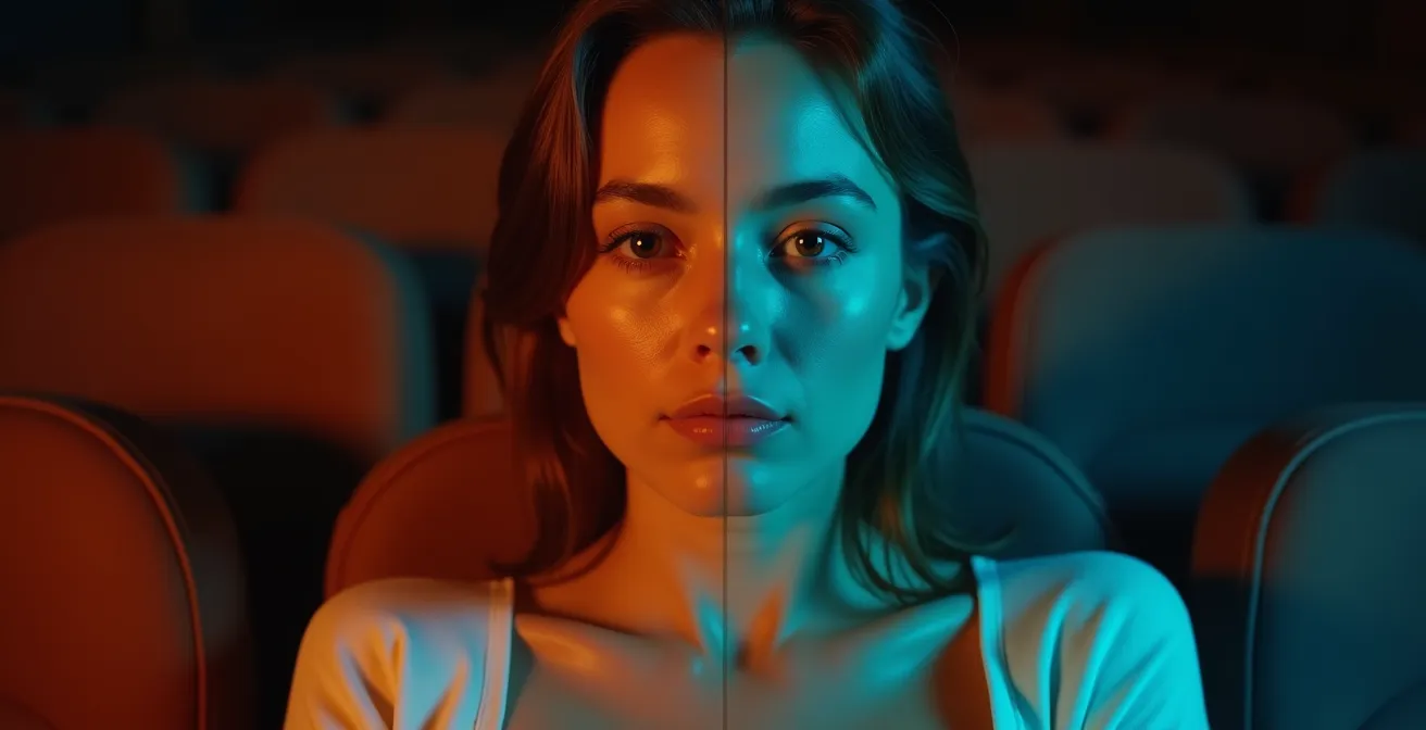
The teal and orange palette has become the single most recognizable—and criticized—trend in modern cinema. Its omnipresence isn’t a result of lazy artistry, but a convergence of technical efficiency and potent psychological wiring. The core reason for its dominance is its relationship to skin tones. Human skin, regardless of ethnicity, primarily occupies the orange-to-yellow range on a vectorscope. By pushing the surrounding environment—shadows, skies, backgrounds—towards the complementary color, teal, you achieve maximum color contrast. This creates an immediate, subconscious visual separation that makes the human subject “pop” from the frame, guiding the viewer’s eye exactly where the director wants it.
This isn’t just an aesthetic choice; it’s a powerful tool for clarity, especially in action-heavy sequences with fast cuts. An industry analysis reveals that over 72% of top-grossing films in the last decade utilized some variation of this palette. The effect is so reliable that it has become a technical benchmark.
Case Study: The ‘Transformers’ Benchmark
Michael Bay’s Transformers series pushed the teal-and-orange look to such an extreme that it became a go-to example for computer scientists. In a 2013 analysis from Priceonomics, it was noted that researchers building an automatic color grading algorithm used the film as their primary model. The film’s grade served as a computational standard for understanding how the palette creates such effective visual separation between subjects and backgrounds, cementing its status not just as a creative fad, but as a technically potent industry tool.
While critics decry its overuse as creating a homogenous look across cinema, understanding its function is key. It’s a powerful, if blunt, instrument for controlling viewer attention. The challenge for a modern colorist isn’t to simply avoid it, but to know when to use it subtly and when to subvert it for a different emotional impact.
How to Grade a Stylized Look Without Ruining Skin Tones?
This is the tightrope walk of every colorist. You’re tasked with creating a unique, stylized world—a neon-drenched cyberpunk city, a dusty western landscape, a sterile sci-fi laboratory—but the human face must remain believable. A common mistake is to apply a “primary” grade across the entire image, which inevitably contaminates the skin tones, leaving actors looking sickly green, overly flushed, or unnaturally pale. This immediately breaks the viewer’s immersion and suspension of disbelief. The key to avoiding this is to move beyond global adjustments and embrace secondary qualifications.
The process is surgical. It involves isolating a very specific range of color, saturation, and luminance—in this case, the range that represents skin. Professional grading software allows you to create a “key” or “mask” based on these HSL (Hue, Saturation, Luminance) values. Once the skin tones are cleanly isolated, you can effectively create two separate grades: one for the skin, and one for everything else. You can push the background into a deep, moody blue while ensuring the actor’s face retains its natural warmth and dimensionality.
This allows for the best of both worlds: a highly stylized environment and a pleasing, naturalistic subject. It’s a delicate dance of pushing and pulling, often requiring multiple layers of finely-tuned keys to handle different lighting conditions or skin types within a single scene. This is where a colorist truly earns their keep, transforming a flat, digitally captured image into a living, breathing one, no matter how fantastical the setting.
Ultimately, a successful grade is one where the style feels immersive, not distracting. If the audience is thinking about the color of the walls, you’ve likely succeeded. If they’re thinking about the strange color of the actor’s face, you’ve failed. The integrity of the human element is paramount.
LUTs or Manual Grade: Which Offers More Control Over the Final Image?
The debate between using LUTs (Look-Up Tables) and grading manually from scratch is often framed as a false dichotomy: the quick-and-dirty amateur versus the meticulous professional. The reality in a professional suite is far more nuanced. A LUT is not an Instagram filter; it’s a mathematical transform that remaps color values. While it can be used to apply a “look,” its real power lies in its utility as a calibrated starting point or a technical conversion tool. Manual grading, on the other hand, offers infinite, granular control but can be painstakingly slow.
The truth is, most high-end workflows are a hybrid. A colorist might use a technical LUT to convert LOG footage to a standard Rec.709 color space, then begin their manual primary corrections for balance and contrast. From there, they might “audition” several creative LUTs—not as a final step, but as sources of inspiration. A LUT might have a beautiful contrast curve or a unique color relationship in the shadows that can be isolated, dialed back to 50% intensity, and then serve as the foundation for a much more customized manual grade. The idea that professional colorists never touch LUTs is a myth; they’ve been a staple for decades in technical conversion and VFX integration. The difference is they are used with intentionality and control.
In the trench of a tight deadline, the efficiency of a well-crafted LUT is undeniable. As one colorist humorously noted in an industry analysis from Priceonomics:
Your average colorist has to grade about two hours of movie, frame by frame sometimes, in the space of a couple of weeks. It doesn’t take that many glances at the deadline bearing down on the calendar before you throw up your hands and say, ‘Fuck it. Everybody likes teal and orange!’
– Anonymous Professional Colorist, Priceonomics Industry Analysis
This highlights the real-world pressures that make a hybrid approach so valuable. The question isn’t “LUT or manual?” but rather “How can I use every tool at my disposal to achieve the desired look with the highest quality and efficiency?” The ultimate control comes not from a dogmatic adherence to one method, but from the wisdom to know when and how to combine them.
The Calibration Mistake That Makes Your Film Look Green on TV
A colorist can spend weeks crafting the perfect, emotionally resonant grade on a flawlessly calibrated, multi-thousand-dollar reference monitor in a perfectly dark room. But the moment the film is viewed on an uncalibrated consumer television in a brightly lit living room, that work can be completely undone. This is the great, often-ignored variable in color grading: the audience’s viewing environment. One of the most common and frustrating issues is the color shift, particularly a push towards green or magenta, on consumer displays.
Most consumer TVs come from the factory with their colors pushed to be overly bright and saturated to stand out on a showroom floor, with little regard for accuracy. Their “Standard” or “Vivid” modes often have an incorrect color temperature, causing neutral grays to appear tinted. Research on display technology demonstrates that colors vary significantly by display type, with consumer TVs showing up to a 30% variance from reference monitors. If a TV’s white point is skewed towards green, your entire film will inherit that green cast, turning your carefully balanced skin tones sickly and your neutral environments bizarre.
Case Study: The ‘Game of Thrones’ Darkness Controversy
The infamous Game of Thrones episode “The Long Night” became a cultural touchstone for this very problem. The episode was graded to be extremely dark and low-contrast, a bold artistic choice meant to be viewed on high-end, calibrated displays in a pitch-black environment. However, for the millions of viewers watching on poorly calibrated LCD TVs in moderately lit rooms, the image compression and display limitations rendered huge portions of the episode an unwatchable, muddy mess. This highlighted a critical disconnect: artistic intent can be completely undermined if the final viewing environment isn’t considered.
While you can’t calibrate every viewer’s television, you can grade defensively. This means regularly checking your grade on a consumer-grade television, viewing it under various lighting conditions, and avoiding extremely dark or low-contrast looks unless the project is destined for a controlled theatrical release. It’s a crucial quality control step that bridges the gap between the perfect world of the color suite and the imperfect reality of the living room.
Desaturation vs. Vibrance: Visual Cues for Flashbacks?
The desaturated, slightly blurry flashback is one of the most overused clichés in the cinematic playbook. It’s a lazy shorthand for “memory” that often fails to convey any specific emotion beyond “this happened in the past.” A more sophisticated approach to temporal shifts involves thinking about the *emotional quality* of the memory itself. Is it a faded, distant memory? Or is it a cherished, vibrant moment that feels more real than the present? The choice between reducing color (desaturation) and intensifying it (vibrance) is a fundamental narrative decision.
Desaturation works well for traumatic, painful, or emotionally hollow memories. By draining the color, you visually communicate a sense of loss or detachment. However, for memories of joy, love, or a romanticized past, pushing the vibrance and saturation *up* can be far more effective. This suggests that the memory is a warm, idealized refuge from a colder, more neutral present. The key is to create a distinct visual contrast between the past and the present that serves the story’s emotional arc.
Case Study: The Hyper-Saturated Memories of ‘Amélie’
Jean-Pierre Jeunet’s Amélie famously rejected the desaturated flashback cliché. Instead, its vision of Paris is a hyper-real, deeply saturated world of lush reds, golds, and greens. The film’s palette represents Amélie’s whimsical, romanticized internal world, and by extension, a nostalgic, idealized version of the past. This choice proves that memory doesn’t have to be faded; it can be portrayed as more vivid and emotionally intense than reality itself, a principle that radically expands the colorist’s toolkit for depicting memory.
Furthermore, color is not the only tool. A skilled filmmaker can signal a shift in time through a variety of other visual cues, often in combination with a subtle color grade, to create a more unique and compelling effect.
Actionable Plan: Alternative Techniques for Temporal Shifts
- Aspect Ratio Changes: Shift from a wide 2.35:1 for the present to a more constrained 4:3 for flashbacks to create a feeling of a contained, past moment.
- Texture & Grain Overlays: Add a specific film grain profile as the primary indicator. A gritty 16mm grain can signify a recent, documentary-style memory, while a soft 8mm grain can evoke childhood.
- Lens & Optical Emulation: Recreate the characteristics of vintage lenses. Introduce subtle halation around light sources, a softer overall focus, or chromatic aberration to age the footage organically.
- Frame Rate Manipulation: Alter the frame rate for memories. Slightly over-cranking (e.g., shooting at 28fps and playing back at 24) can create a subtle, dreamlike slow-motion effect.
- Selective Color Isolation: Keep the overall palette desaturated but allow one key color—the red of a dress, the yellow of a flower—to remain fully vibrant, linking the memory to a specific emotional anchor.
Why Blue Artwork Sells Better in Corporate Office Environments?
The principles of color psychology that filmmakers use to guide emotion are not confined to the screen. They are actively employed in interior design, branding, and even the art market. The pronounced preference for blue artwork in corporate settings is a prime example of color being used as a tool for environmental mood control. It’s not simply because blue is a “calm” color; it’s because it subconsciously communicates a specific set of values crucial to a business environment: stability, logic, and trust.
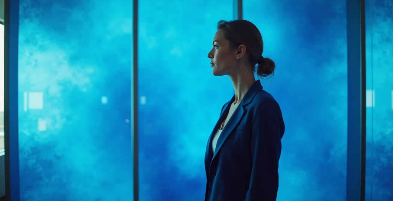
As noted by the Corporate Design Psychology Institute, the color blue has deep-seated associations with authority and reliability—think “blue-chip” stocks or the concept of being “true blue.” This is not merely cultural; it has a measurable psychological effect. Studies in color psychology demonstrate that blue helps viewers feel secure and think more rationally, potentially increasing the perception of trust by up to 15%. In a high-stakes corporate environment, surrounding employees and clients with a color that fosters focus and security is a strategic decision.
A filmmaker can use this same principle in characterization. A stoic, intellectual, or highly dependable character is often costumed in or framed against shades of blue. It provides a non-verbal cue to the audience about their personality. Conversely, a corporate office graded with a sickly yellow or an aggressive red would immediately signal to the audience that something is wrong—that there is chaos, sickness, or danger lurking beneath the professional veneer. The choice to lean into or subvert these established associations is a core part of visual storytelling.
The corporate world’s reliance on blue is a real-world case study in mass-market color grading. It’s an environment “graded” to evoke a specific, desired emotional and cognitive state: one of calm, focused productivity.
How Lighting Temperature Alters the Perception of Classical Paintings?
Before digital color grading, before even the invention of cinema, artists were already masters of manipulating color and light to evoke emotion. The “grade” of a classical painting was determined by the artist’s pigment choices and, crucially, the intended viewing light. A painting created in the 17th century to be viewed by the warm, flickering glow of a candle (around 2700K) is a fundamentally different object when seen under the cool, neutral glare of a modern museum’s LED lights (5000K+). The light source acts as a real-time color grade, re-interpreting the art for the viewer.
This is not a subtle effect; it dramatically alters the emotional impact. The warm light of a candle is low on the color rendering index, meaning it accentuates reds, oranges, and yellows while muting blues and greens. This enhances the drama and intimacy of Baroque-era paintings, which were designed with this in mind. The deep shadows become richer and the highlights on skin feel warmer and more alive. When you view that same painting under a neutral, full-spectrum light, the technical accuracy of the colors increases, but the original emotional intent—the drama, the intimacy—is often diminished.
Museum studies on Rembrandt’s work, for instance, perfectly illustrate this. One analysis found that viewers reported up to 40% higher emotional engagement and a greater sense of intimacy when viewing his paintings under lighting that mimicked candlelight, as opposed to standard museum lighting. The lighting temperature is, in effect, a grade that either aligns with or fights against the artist’s original vision. The table below outlines how different light temperatures can impact the perception of various art styles.
| Light Temperature | Artwork Type | Emotional Impact | Viewer Response |
|---|---|---|---|
| 2700K (Warm/Candlelight) | Baroque Paintings | Intimacy, Drama | Enhanced depth perception, longer viewing times |
| 3500K (Halogen) | Impressionist Works | Nostalgia, Warmth | Increased color vibrancy perception |
| 5000K (Daylight) | Modern Abstract | Clarity, Truth | Accurate color reproduction, analytical viewing |
| 6500K (Cool White) | Contemporary Digital | Detachment, Precision | Focus on composition over emotion |
For a colorist, this is a profound lesson. It reinforces the idea that color and emotion are inextricably linked to the context of light. Our job is a modern extension of what painters have always known: we are not just coloring an image, we are defining the light that reveals it.
Key Takeaways
- Effective color grading is not about following rules but about making intentional narrative choices to control viewer perception.
- Technical challenges, like protecting skin tones and accounting for audience viewing environments, are as important as creative decisions.
- The most powerful looks often come from a hybrid workflow, combining the efficiency of LUTs with the precision of manual grading.
How to Create Believable Sci-Fi Worlds on a Limited Indie Budget?
For an independent filmmaker, building a believable science fiction world can seem impossible. Lacking the budget for extensive sets, costumes, or visual effects, many projects fail to establish a cohesive, otherworldly atmosphere. This is where color grading transitions from a finishing touch to the single most powerful and cost-effective world-building tool available. A consistent, stylized grade can unify disparate, low-budget locations into a single, believable universe.

By defining a strict color palette, a filmmaker can tell the audience everything they need to know about the world without a line of dialogue. A world graded with a sterile, monochromatic palette of blues and cold whites immediately feels clinical, futuristic, and possibly oppressive. Another world, drenched in a sickly yellow-green cast with crushed, inky blacks, suggests pollution, decay, and dystopia. The same suburban office park can be transformed into a utopian corporate headquarters or a dystopian surveillance center purely through the grade. This ensures that even the most mundane locations serve the story’s atmosphere.
Case Study: The $7,000 World of ‘Primer’
Shane Carruth’s time-travel film Primer, famously made for a mere $7,000, is a masterclass in atmospheric world-building through color. The film’s cold, detached, and deeply intellectual tone was achieved almost entirely through its grade. By bathing its mundane suburban locations—garages, storage units, office parks—in a consistent, sterile palette of institutional greens and fluorescent blues, Carruth created an overwhelming sense of scientific detachment and simmering unease. The grade was the primary visual effect, unifying the disparate settings into a cohesive technological nightmare and proving that a compelling sci-fi world is born from vision, not budget.
The key for indie filmmakers is to shoot for the grade. This means capturing footage in a LOG or RAW format that preserves the maximum amount of dynamic range and color information. This flat, desaturated footage is a blank canvas, giving the colorist the flexibility to push the image in any direction without it falling apart. A strong grade is the ultimate cinematic alchemy, turning the mundane into the magnificent.
By understanding that every color choice is a narrative choice, you move from being a technician to a storyteller. The true art of color grading lies in this intentionality—in knowing the rules of psychology and technology so thoroughly that you can bend them to your will, creating a subconscious emotional journey that is uniquely your own. To continue developing this skill, a return to the foundational principles of popular trends like Teal and Orange provides a solid starting point for deconstruction and reinvention.