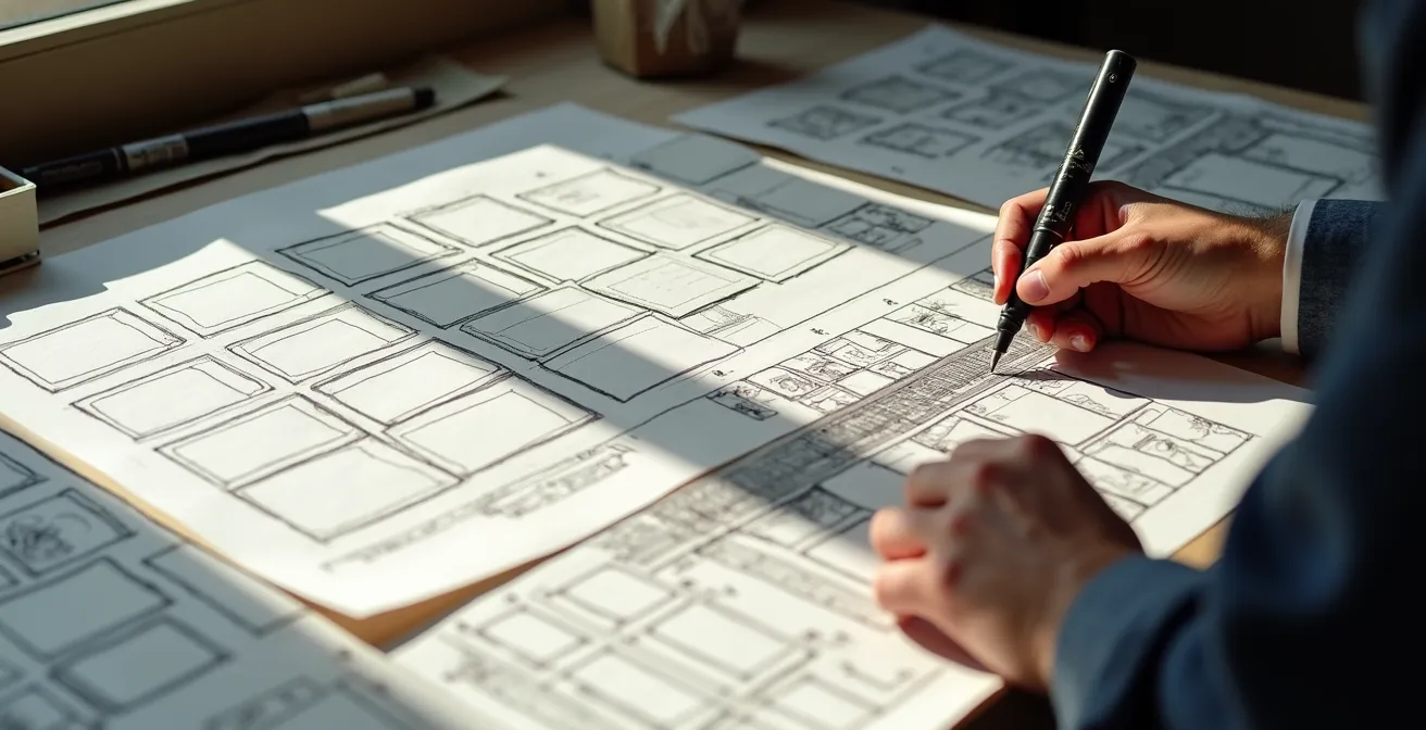
Effective comic pacing is not an accident of intuition; it is a deliberate act of architectural design. This guide moves beyond simple tips to reveal how every structural choice—from the width of a gutter to the placement of a page turn—is a tool for manipulating the reader’s internal clock and emotional investment. Mastering this visual architecture is the key to creating a truly immersive narrative experience.
For many comic book artists and writers, pacing feels like an elusive, almost magical quality. A story can have compelling characters and a brilliant plot, yet feel sluggish or rushed. The dialogue is sharp, the art is polished, but the emotional beats don’t land. The common advice—vary your panel sizes, use a splash page for big moments—is a starting point, but it barely scratches the surface. It treats the symptoms without diagnosing the underlying structural issues. This approach often overlooks the sophisticated visual language that readers instinctively understand.
The real craft lies in the invisible architecture of the page. Pacing isn’t just about the speed of your action scenes; it’s about controlling the reader’s perception of time, guiding their emotional journey, and building narrative tension through purely structural means. It’s about understanding that the blank space of the gutter is as important as the drawn panel, and that the physical act of turning a page is a powerful narrative device in its own right. It requires thinking like an editor and an architect, not just an artist.
But what if the true key to pacing wasn’t in what you draw, but in how you frame it? This guide deconstructs the core mechanics of visual storytelling. We will explore how to weaponize the page turn, how gutter width dictates the reader’s internal clock, and how the careful balance of text and image can make or break a scene’s emotional weight. By mastering these structural principles, you can move from simply telling a story to orchestrating a reader’s experience with precision.
This article dissects the fundamental techniques that form the visual grammar of sequential art. The following sections provide a complete blueprint for taking control of your story’s rhythm and flow.
Summary: Mastering Panel Layout: The Unseen Architecture of Pacing in Graphic Novels
- The “Page Turn Reveal” Technique That Shocks Readers
- How Gutter Width Influences the Perception of Time Passing?
- Text-to-Image Ratio: The Limit Before a Comic Becomes a Book?
- The 180-Degree Rule in Comics: Preventing Spatial Confusion
- When to Use a Splash Page: The Emotional Beat That Deserves Space
- Why Starting “Late” saves 3 Pages of Exposition?
- How to Speak “Camera Language” to Get the Shot You Want?
- How to Write a Complete Narrative Arc in Less Than 10 Pages?
The “Page Turn Reveal” Technique That Shocks Readers
The single most powerful tool for suspense in a physical comic is the page turn. It’s a moment of literal, physical transition where the reader is blind. Unlike film, where the editor controls the cut, here the reader is an active participant. They control the reveal. As an editor, your job is to weaponize this moment. The left-hand page (a verso) builds anticipation, creating a question, a threat, or an unresolved tension. The right-hand page (a recto) provides the answer, often in a shocking or unexpected way. This is not just a surprise; it’s a physical punctuation mark in the story.
A successful page turn reveal is an exercise in controlled suspense. The final panel on the left page must act as a hook, compelling the reader to turn the page not just to continue the story, but to resolve a specific, immediate tension. This could be a character looking off-panel at an unseen threat, a line of dialogue that hangs in the air, or a close-up on an object whose significance is about to be revealed. The goal is to make the act of turning the page an integral part of the narrative itself, transforming it from a simple mechanical action into a moment of dramatic release or impact.
Action Plan: Engineering the Perfect Page Turn Reveal
- Build Anticipation: Use the left-hand page to build rising tension or present incomplete visual information that creates a narrative question.
- End with a Hook: Conclude the left page with a strong visual or narrative hook that demands an immediate answer or resolution.
- Guide the Eye: Employ panel composition and reading flow to naturally lead the reader’s eye towards the right-hand edge of the page.
- Subvert Expectations: Design the right-hand reveal to either subvert, exceed, or starkly contrast with the expectations you built.
- Maximize Impact: Consider using a full splash page or a dramatic shift in panel size for the reveal to give it maximum visual weight.
Case Study: Watchmen’s 9-Panel Grid Page Turns
Alan Moore and Dave Gibbons’ Watchmen provides a masterclass in using a rigid structure to amplify reveals. The relentless 9-panel grid creates a steady, almost hypnotic reading rhythm. This consistency makes any deviation incredibly powerful. When Moore and Gibbons deploy a page turn reveal, it often breaks this pattern or uses the grid to create a stark contrast. In issue #8, for example, a page of brutal, fast-paced violence on the left is followed by a page turn that reveals a quiet, contemplative, and emotionally devastating scene on the right. This creates a psychological whiplash for the reader, perfectly mirroring the characters’ states and demonstrating how the physical structure of the book can be a tool for emotional storytelling.
How Gutter Width Influences the Perception of Time Passing?
If panels are moments in time, then the gutter—the empty space between them—is time itself. This is the core of manipulating the reader’s internal clock. The width of the gutter is not an arbitrary design choice; it’s a direct instruction to the reader on how to perceive the passage of time between moments. A thin, hairline gutter suggests that the action between panels is nearly instantaneous. It creates a sense of urgency, speed, or even claustrophobia. Conversely, a wide gutter forces a longer pause. It tells the reader that significant time has passed, a new scene is beginning, or that they should linger on a moment for emotional reflection.
This control over temporal perception is fundamental to pacing. In sequential art, the narrative largely unfolds in these blank spaces, as research shows that action-to-action transitions account for over 65% of all panel transitions in Western comics. The reader’s brain actively fills in the missing action based on the visual cues provided. By consciously designing the “pauses” with your gutter choices, you guide that mental process. No gutter at all, with panels bleeding into each other or overlapping, can signify chaos, simultaneous action, or a fractured psychological state. Mastering the gutter is mastering the rhythm of your story.
This visual manipulation of time is one of the most subtle yet powerful tools in the artist’s arsenal. The abstract demonstration above shows how the negative space dictates the flow. The following table breaks down this “spatial grammar” into a practical guide, linking the physical space on the page to its narrative and emotional effect.
This table, based on an analysis of common page composition techniques, provides a clear framework for making deliberate choices about gutters.
| Gutter Width | Time Perception | Emotional Effect | Best Used For |
|---|---|---|---|
| Hairline (1-2mm) | Immediate/Continuous | Urgency, Claustrophobia | Action sequences, rapid movement |
| Standard (3-5mm) | Normal progression | Neutral flow | Regular dialogue, standard scenes |
| Wide (6-10mm) | Pause/Time skip | Contemplation, Distance | Scene changes, quiet moments |
| No Gutter (Overlapping) | Simultaneous | Chaos, Unity | Multiple viewpoints, fractured time |
Text-to-Image Ratio: The Limit Before a Comic Becomes a Book?
The balance between words and pictures is the central tension of the comics medium. Lean too heavily on text, and you create narrative friction, slowing the reader to a crawl and undermining the visual flow. Lean too heavily on images without sufficient textual anchors, and you risk ambiguity. There is no single “correct” ratio; the ideal balance is dictated entirely by the desired pacing and emotional intent of the scene. A fast-paced action sequence might be almost entirely silent, relying on panel flow and composition to convey speed. A dense, character-driven dialogue scene will naturally have more text.
The challenge intensifies in the modern market. As recent data reveals that 63% of comic store sales in 2024 came from graphic novels versus periodicals, creators are often working with longer formats where pacing across chapters is crucial. A text-heavy page isn’t inherently bad, but it is a deliberate choice to slow the reader down. It asks them to stop looking and start reading. This can be used effectively to deliver crucial exposition or to create a sense of information overload for a character. However, if the goal is to evoke a feeling, it’s often better to let the images do the work and give the moment space to breathe.
This idea of giving emotion space is a critical editorial concept. As acclaimed creator Faith Erin Hicks notes, the visual medium offers unique opportunities for emotional resonance that text alone cannot achieve:
Emotion takes time. When I draw a scene that is emotional, when characters are struggling with something, I want my readers to feel what the character is feeling, and one of the best ways to do that is to take my time.
– Faith Erin Hicks, Making Comics: Emotion and Pacing in Comics
This “taking time” is achieved by reducing text and allowing the reader to linger on the visual storytelling—the character’s expression, their body language, the environment. The decision to use more text or more image is a decision about where the reader’s attention and time should be spent. It is a fundamental pacing control.
The 180-Degree Rule in Comics: Preventing Spatial Confusion
Borrowed from cinematography, the 180-degree rule is a cornerstone of clear visual storytelling, forming a key part of the medium’s spatial grammar. Imagine an invisible line (the “axis”) drawn between two characters in a scene. To maintain clear spatial orientation for the reader, your “camera” (the reader’s point of view) should always stay on one side of that line. If Character A is on the left and Character B is on the right, they should remain in those relative positions from panel to panel. Crossing the line without a clear transition flips their positions, which can instantly disorient the reader and break their immersion in the story.
While it’s called a “rule,” it’s more accurately a principle of clarity. On a static page, where the reader must mentally construct the 3D space of a scene from a series of 2D images, consistent orientation is vital. Breaking the rule intentionally can be a powerful creative choice. It can be used to create a sense of chaos, panic, or psychological disorientation in a character. However, it must be a conscious decision, not an accident. An establishing shot or a neutral panel showing the “camera” moving across the axis can help re-orient the reader if a jump is necessary.
Maintaining this axis ensures that the reader doesn’t waste cognitive energy figuring out “who is where” and can instead focus on the narrative and emotional content of the scene. It is a foundational element of invisible storytelling. To apply it effectively:
- Establish an imaginary line of action or conversation between the key elements of your scene.
- Keep your panel viewpoints consistently on one side of this line for the duration of the scene.
- If you must cross the line, use a transitional panel (like a shot on the line itself or a neutral wide shot) to guide the reader through the spatial shift.
- Remember to account for reading direction; the principle applies equally in Western left-to-right and manga right-to-left formats.
When to Use a Splash Page: The Emotional Beat That Deserves Space
A splash page—a single panel that takes up an entire page or a double-page spread—is the ultimate allocation of emotional real estate. In a medium where page count is a finite and valuable resource, dedicating an entire page to a single image is a massive narrative investment. It is the visual equivalent of a dramatic pause, a swell of orchestral music, or a slow-motion shot in a film. Therefore, it should never be used lightly. A splash page must be earned. The preceding panels and pages must build up to a moment so significant that it demands this level of visual emphasis.
The primary functions of a splash page are to establish a setting (an establishing shot), reveal a shocking plot twist, introduce a major character, or, most importantly, to land a climactic emotional beat. It forces the reader to stop. They cannot simply glance and move on; the scale of the image commands their attention and invites them to absorb the details and the atmosphere. It gives a moment weight and significance. Using a splash page for a minor event devalues the tool and weakens the impact when you truly need it. It is a declaration by the creator that “This moment matters. Pay attention.”
The Economics of Splash Pages in Limited Page Counts
In the standard 22-page monthly comic, every page is prime real estate. Committing to a splash page means sacrificing space that could have been used for multiple panels of plot progression or character interaction. As an editorial analysis of paneling flow highlights, this investment must yield a significant return in reader engagement. Publishers find that comics with strategically placed splash pages that punctuate a major reveal or an emotional climax consistently score higher in reader satisfaction. The technique serves to anchor the narrative, giving readers a memorable, high-impact image that defines an issue or an entire story arc. The key is ensuring the moment is “earned” through sufficient narrative buildup, making the visual pause a reward rather than an interruption.
Why Starting “Late” saves 3 Pages of Exposition?
Starting a story *in media res*—in the middle of the action—is a powerful technique for seizing reader attention and establishing a brisk pace from the very first panel. It’s an act of faith in your visual storytelling and in the reader’s intelligence. Instead of spending several pages on tedious exposition explaining who the characters are, where they are, and what led them to this moment, you drop the reader directly into a compelling situation. This immediately raises questions and creates a sense of forward momentum. The “who, what, and where” is then revealed organically through dialogue, action, and environmental details as the story unfolds.
This approach respects the reader by trusting their visual literacy. You don’t need a caption box that says “Neo-Gotham, 2049.” You can show it with flying vehicles, futuristic architecture, and cyberpunk fashion. You don’t need to explain that a character is a grizzled detective. You can show it with a messy office, a half-empty bottle of whiskey, and a world-weary expression. This method of “show, don’t tell” is the essence of the comic medium. By starting late, you trade slow, front-loaded exposition for immediate engagement and mystery, effectively saving valuable page space for the story that truly matters.
To successfully bypass traditional setup, you can employ a variety of visual shortcuts on your opening pages:
- Use a strong establishing shot to convey location, time of day, and mood without a single word of dialogue.
- Communicate a character’s profession and personality through their costume, props, and the state of their immediate environment.
- Implant backstory through visual symbols, such as old photographs on a desk, a prominent scar, or a meaningful tattoo.
- Begin with an action or a conflict already in progress, forcing the reader to catch up and become instantly invested in the outcome.
- Trust that your audience has a sophisticated understanding of genre tropes and visual language to fill in contextual gaps.
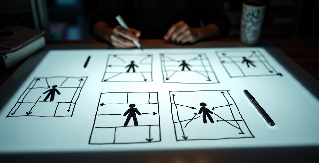
How to Speak “Camera Language” to Get the Shot You Want?
In comics, the artist is the director, the cinematographer, and the entire camera crew. Every panel is a “shot,” and the choice of shot is a critical storytelling decision that dictates the reader’s emotional relationship to the scene. Speaking this “camera language” fluently means understanding how different “angles” and “distances” affect the narrative. A wide shot establishes context and scale, while a close-up creates intimacy and focuses on emotion. A low-angle shot can make a character seem powerful and heroic, while a high-angle (or bird’s-eye view) can make them appear vulnerable or small.
This is not simply about creating visual variety; it is about guiding the reader’s emotional response with precision. A sequence of panels that cuts from a wide shot to a medium shot to a close-up pulls the reader deeper into a character’s personal space and emotional state. A Point-of-View (POV) panel puts the reader directly into the character’s shoes, creating maximum immersion and empathy. By thinking like a cinematographer, the artist can orchestrate a complex visual symphony that tells a story far more effectively than static, medium-shot drawings ever could. The key is to choose the shot that best serves the emotional purpose of the moment.
This translation from cinematic principles to the comic page is direct and powerful. This table, drawing from a breakdown of storyboard techniques, serves as a practical glossary for any creator looking to expand their visual vocabulary.
| Comic Panel Type | Film Equivalent | Emotional Impact | Common Usage |
|---|---|---|---|
| Close-up | Close-up shot | Intimacy, emotion | Character reactions, details |
| Wide panel | Establishing shot | Context, scale | Scene setting, environments |
| Bird’s eye view | Overhead shot | Vulnerability, overview | Spatial relationships |
| Worm’s eye view | Low angle shot | Power, intimidation | Heroic moments, threats |
| POV panel | Point-of-view shot | Immersion, empathy | Reader identification |
Key Takeaways
- Pacing is Architecture: Treat your page layout as a blueprint designed to guide the reader’s experience, not just a canvas for drawings.
- Space is Time: The gutter is not empty space; it is a pacing tool used to control the reader’s internal clock and the perceived time between moments.
- Invest in Emotion: Use high-impact tools like splash pages and page-turn reveals as calculated investments of “emotional real estate” to make key moments land with maximum force.
How to Write a Complete Narrative Arc in Less Than 10 Pages?
Writing a satisfying narrative arc in a short page count—like an anthology submission or a webcomic short—is an exercise in extreme narrative efficiency. It is not about cramming a 100-page story into 10 pages; it is about choosing a story that is perfectly scaled for that length. This requires a ruthless focus on a single, clear theme and a simple three-act structure: a setup that introduces a character and their immediate problem, a confrontation where they face an obstacle, and a resolution that shows the outcome and a change in the character’s state. Every single panel must serve this arc.
The key to this compression lies in the strategic use of panel transitions. The choices you make about how to move from one moment to the next dictate the pace and efficiency of the story. While Western comics often rely on action-to-action transitions to move the plot forward, other forms can be just as effective for condensed storytelling. An aspect-to-aspect transition, for example, can establish a mood or a setting in just a few panels without any plot movement at all, allowing for great atmospheric efficiency.
Case Study: Scott McCloud’s Panel Transition Theory in Practice
In his seminal work ‘Understanding Comics,’ Scott McCloud identifies six types of panel-to-panel transitions that act as the invisible engine of comic narrative. His analysis reveals a key difference in pacing strategies: Western comics heavily favor action-to-action, subject-to-subject, and scene-to-scene transitions to drive the plot forward with maximum momentum. In contrast, Japanese manga frequently employs aspect-to-aspect transitions, which juxtapose different elements of a scene to build a mood or atmosphere. This allows manga to create rich, contemplative moments and establish a strong sense of place very efficiently, demonstrating that a complete narrative experience can be built through atmosphere as much as through direct action, a crucial lesson for short-form storytelling.
One of the most effective structural tools for enforcing this kind of narrative discipline is a rigid grid system, a concept championed by masters of the form like Alan Moore.
The 9-panel grid forces concise, rhythmic storytelling where every panel must serve a critical function in the arc. It’s a narrative engine that demands efficiency.
– Alan Moore, Watchmen Creative Process Discussion
By adopting a restrictive structure like the 9-panel grid, you force yourself to make every moment count. There is no room for wasted space or narrative detours. This constraint breeds creativity, pushing you to find the most potent images and the most efficient transitions to tell a complete, impactful story within a very limited space.
Ultimately, mastering layout and pacing is about embracing this architectural mindset. It requires you to see the page not as a series of drawings, but as a carefully constructed experience for the reader. By applying these structural principles with intent, you can begin to orchestrate your narratives with the precision of an editor and the vision of a director.